Excel
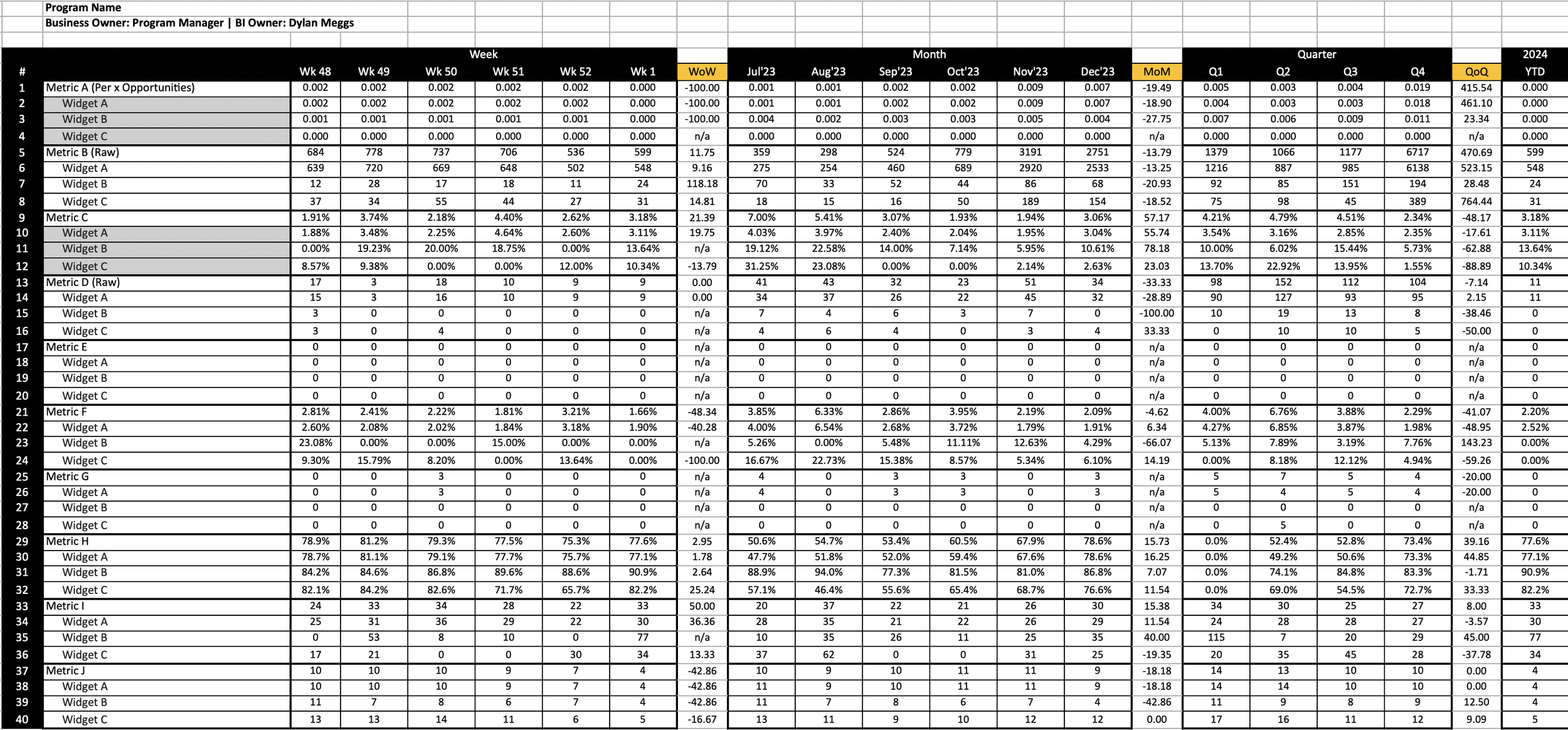
Past artifacts include Excel-based reports which forecast, display trends over time, compare aggregations for A/B testing, or stack attributes for operations monitoring. Metric pipelines are automatically orchestrated or entered manually depending on business needs. Automations include Power BI connected to a dbt data mart (see Git) and various internal company tools which feed from Redshift. Several examples include datasets with billions of rows which are unloaded to S3, transformed with Python’s Pandas library, and integrated within Amazon’s DSP Portal website. Excel is my preferred tool for reporting one-time analyses, manual datasets, and simple trend comparisons with many metrics in one place.
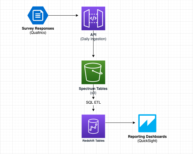
Qualtrics Architecture (One of Several Design Iterations)
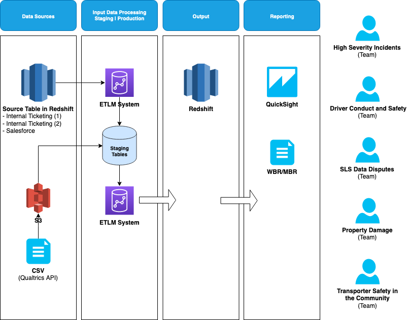
Typical Operations Team Reporting Architecture
QuickSight / Tableau
QuickSight and Tableau are my preferred platforms for reoccurring reports, self-service tools, and large datasets. They offer scalable design, optimal performance, and customization. My dashboards often track trends over time with line charts that compare metric values against a moving average with upper and lower bounds. This methodology is referred to as Bollinger Bands in stock trading, and I’ve found them to be consistently reliable indicators across all business functions with volatile metrics. Other metrics require line charts which compare goals vs actuals or use stacked bar charts to consolidate metric slices into one view.
Developing hundreds of metrics over the years has taught me that each report has unique design needs. However, building replicable templates allows us to launch new reports with speed while improving data quality and saving hundreds of hours in maintenance cost each year. Some customization is always required, but scalability is critical to ensure success in a large and fast growing business. I facilitate this by developing SSOT metric aggregation tables with standardized formats and keeping all custom SQL outside of the dashboard where possible.
The screenshots below depict a Disney QuickSight Dashboard I put together in 10 minutes using a csv file on 10/04/2023.
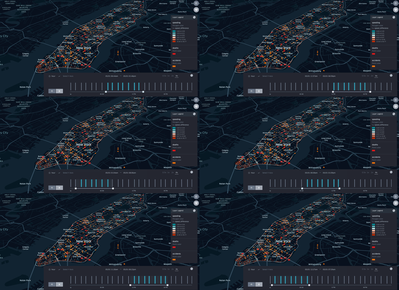
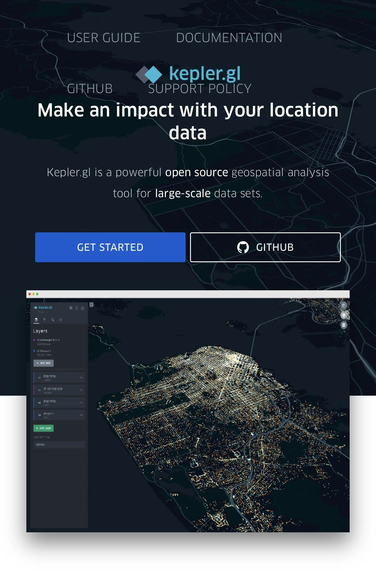
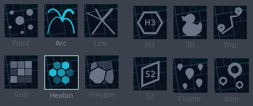
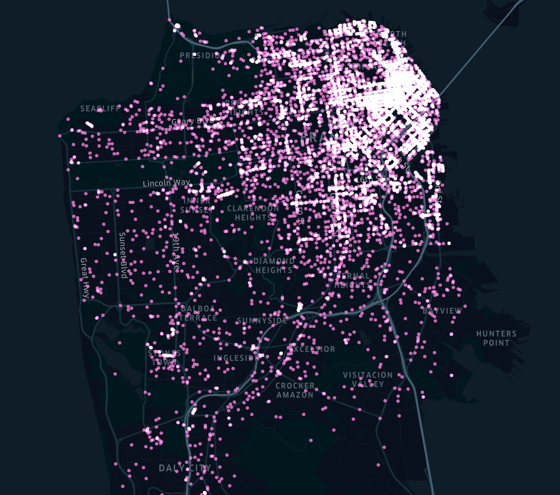
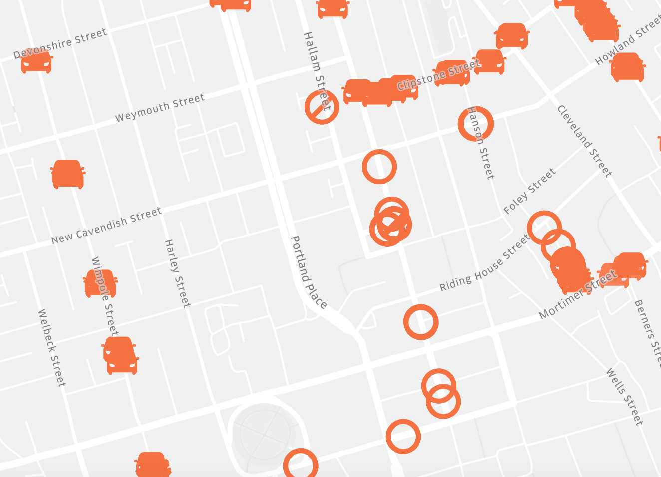
During my time at Uber, tracking the movement of cellphones was a critical part of the job. I leveraged Apache HiveQL and PostreSQL to write queries and generate csv files which were uploaded to Kepler.gl software. From there, I analyzed device speed, location, proximity, and account associations to make decisions. These findings were compiled in JIRA reports and designed in coordination with claims, legal, local law enforcement, and the FBI.
My expertise in this field gave me the opportunity to train dozens of new hires, write onboarding SOPs, and consult 50+ leaders throughout the company.
Geospatial Data
Various Samples
Databricks: Spark Training Notebook
Places Dylan Has Lived (Years)
